AI Visibility Score: You Are Measuring the Wrong Funnel Stage
Your AI visibility score went from 48 to 61 last quarter. Nobody in the room can tell you whether that means more deals.
That is not a tooling failure. The platforms doing this work are real, well funded and technically impressive: Profound raised $96M at a $1B valuation in February 2026, Peec AI reached $4M ARR inside ten months, and Otterly starts at $29 a month. They measure exactly what they claim to.
The problem is what gets averaged into the number, and which funnel stage it is drawn from. This is the measurement half of AI visibility, and it is where most programmes go wrong before any content gets written. This post explains how an AI visibility score is built, four things it hides, and what to measure alongside it.
How the score is actually built
Every platform in this category works the same way underneath.
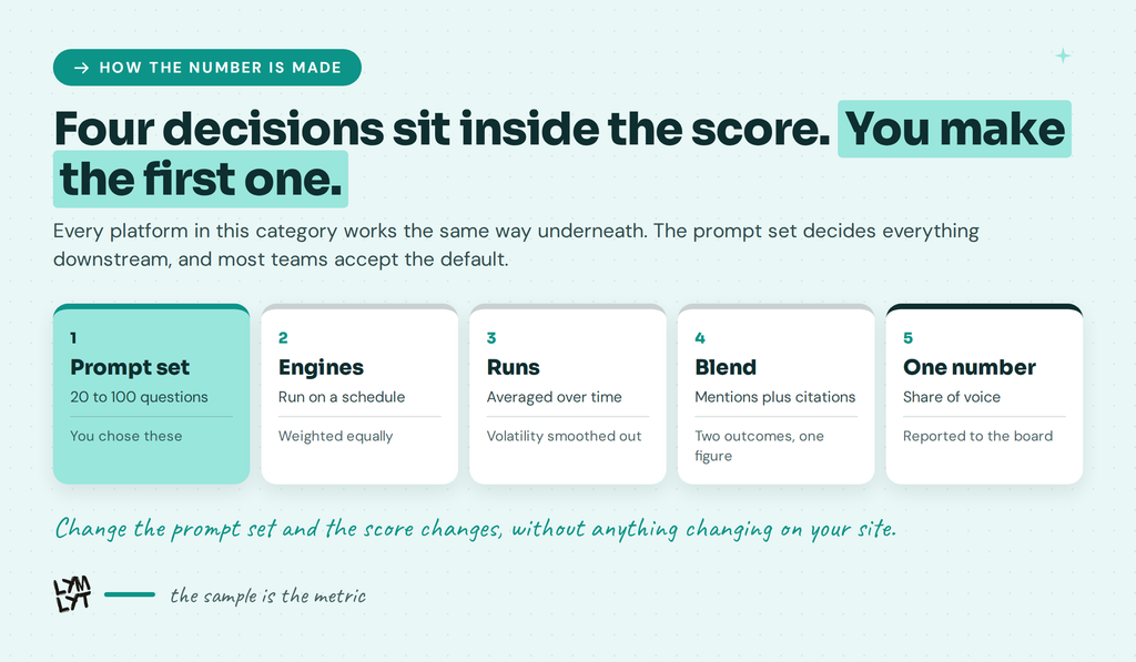
You define a prompt set, usually twenty to a hundred questions. The tool runs them across several engines on a schedule. It records whether your brand is mentioned, whether you are cited with a link, and sometimes where you appear in the answer. Then it averages all of that into one number, often called share of voice or a visibility score.
Four decisions sit inside that pipeline, and you make the first one.
The prompt set is yours. Most teams accept the default suggestions, which are category questions, because that is what the onboarding flow proposes. Everything downstream inherits that choice.
The engines are weighted, usually equally, regardless of where your buyers actually are.
Mentions and citations get blended, though they are different outcomes. Being named is not the same as being linked.
And the runs are averaged across time, which smooths out the volatility that is the most interesting signal in the data.
None of this is hidden. It is just rarely examined, and the result is a single number carrying assumptions nobody in the meeting remembers making.
Problem one: the prompt set is the metric
The score is not a measurement of your visibility. It is a measurement of your visibility across the questions you chose to ask.
Default prompt sets skew heavily toward category questions. “Best CRM for startups.” “Top project management tools.” Those get asked early, by people who are researching rather than buying, long before the shortlist forms, and they are the easiest prompts to think of when a tool asks you to list twenty. Keyword tools have the same blind spot, showing near-zero volume for exactly the queries that convert best.
The questions that decide deals are the four shortlist prompts: comparison, alternatives, pricing and migration. A buyer runs those when they already know your name and are narrowing to one vendor.
Most prompt sets contain few of them, and the ones that are included get averaged in with everything else.
So a rising AI visibility score can mean you are better known. It cannot tell you whether you are winning evaluations, because the evaluation questions are a minority of the sample, and their result is diluted by the majority.
This is a sampling problem, not a technology problem. Every platform here will happily track shortlist prompts. Almost nobody asks them to.
Problem two: two stages, one number
Category prompts and shortlist prompts do not draw on the same sources.
Category answers lean on listicles and review platforms, which is what we found looking at G2 and Capterra, what our wider citation study found across 18 buying questions, and what Ahrefs found across 26,283 cited URLs. Reddit, LinkedIn and YouTube carry more of that load than most dashboards show.
Comparison answers behave differently. When we ran twenty comparison prompts through ChatGPT, Claude and Google AI Mode, ten of the fifteen comparison answers cited nothing at all, and where they did cite, vendor-owned pages won.
Two stages, two source profiles, two different jobs of work to fix them. Averaging them produces a number that responds to neither cleanly.
It also means the fix you deploy after a bad score may be aimed at the wrong half. Publishing more category content will not move comparison answers, and building a vs page will not get you into more listicles. The formats differ too, which is the whole point of alternatives pages versus comparison pages.
Split the score. Report category visibility and shortlist visibility as two lines, and the number starts telling you what to do rather than just how you feel.
Problem three: engines that barely agree
One number across several engines implies the engines are measuring the same thing. They are not.
PromptAlpha’s analysis found that only 11% of domains cited by ChatGPT are also cited by Perplexity. Different retrieval backends, different authority signals, different freshness weighting. Our own run found the same split on a smaller sample: Claude cited nothing at all across five comparison prompts, while Google AI Mode cited sources on four of five.
Blend those into one figure and you get an average of things that cannot be averaged. A brand strong in Perplexity and invisible in ChatGPT scores the same as one that is mediocre in both, and the two situations call for completely different work.
Engine coverage varies by vendor too. Most skip Grok and Meta AI, and coverage across the five main engines remains incomplete across the category. The engines also differ in how they retrieve and cite, which we broke down across ChatGPT, Claude, Gemini, Perplexity and Grok.
Report per engine. If a single blended figure is what reaches the board, make sure the working underneath it is visible, because getting cited in Perplexity is a different discipline from showing up in ChatGPT.
Problem four: it moves without you
Run the same prompt twice in the same hour and you can get different answers. Run it from another country, or in the app rather than the browser, and it changes again.
Writesonic, who sell a tool in this category, put it plainly in their own comparison: AI visibility scores are directional, and answers change across models, locations, interfaces and repeated runs.
That is an honest statement from a vendor and it deserves to be quoted more often. It means a five-point move month to month is noise. It means comparing your score to a competitor’s screenshot from a different location is meaningless. And it means the trend across several runs is the only reading worth acting on.
Treat the number like a survey result with a wide margin of error, not like a rank tracker.
Why your score moved when nothing changed
The most common support ticket in this category is a score that jumped or dropped with no corresponding work. Five things cause it, and only one of them is you.
The model updated. A new version ships and its training data, retrieval behaviour and citation habits all shift at once. Nobody gets notice.
The index refreshed. Engines that retrieve live results are reading a web that changed. A competitor’s new post, or a review site re-crawling, moves your share without you touching anything.
A third party published. One well-placed roundup naming five vendors instead of four changes the answer for every prompt in that category. This is why earned mentions move the number more reliably than on-site work does.
The location or interface changed. App versus browser, logged in versus out, one country versus another. Our own comparison run was from India, and at least one cited URL was a regional pricing page.
Someone edited the prompt set. Adding five prompts changes the denominator. The score moves and the cause sits in a settings panel nobody opens.
Before you explain a movement to anyone, check which of those five happened. Most quarterly narratives about AI visibility are built on a five-point swing that was noise, and the habit of explaining noise is how teams lose credibility with a board.
The defence is boring and effective: freeze the prompt set, fix the location, run monthly, and only discuss movements that persist across three runs. The same discipline applies to tracking how search behaviour shifts generally.
What the score is genuinely good for
This is not an argument for ignoring the metric.
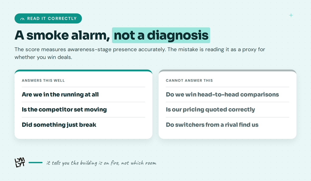
A category AI visibility score answers a real question: are we in the running at all. If you are absent from category answers, no amount of evaluation-stage work will help, because buyers never reach the shortlist stage with your name on it.
It is also the only practical way to track a competitor set over time, and it catches large structural problems early. A score that collapses after a site migration is telling you something urgent, in the way HubSpot’s traffic collapse was urgent long before anyone acted on it.
Use it as a smoke alarm. It tells you the building is on fire. It does not tell you which room.
What to measure alongside it
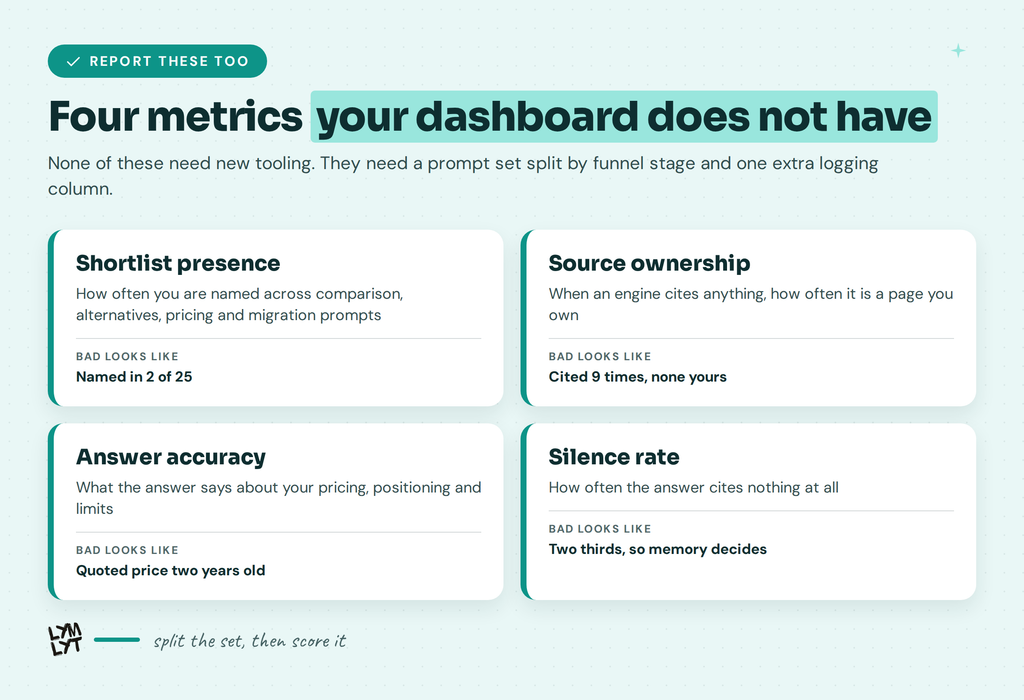
Four metrics, reported separately, that cover the gap.
Shortlist presence. Across your comparison, alternatives, pricing and migration prompts, how often are you named at all. This is the closest thing to a scoreboard for evaluations.
Source ownership. When an engine cites anything on those prompts, how often is it a page you own. Our comparison run found vendor pages winning when engines cited, and the organic results for the same queries told the opposite story, so this is movable and worth tracking on both surfaces.
Answer accuracy. What the answer says about your pricing, your positioning and your limits. A high-visibility wrong answer is worse than absence, and nobody scores this. Stale third-party pages are the usual culprit, which is an outreach problem as much as a content one.
Silence rate. How often the answer cites nothing at all. Two thirds of comparison answers in our run had no sources. That number is a measure of how much the model is working from memory, which tells you whether this quarter’s work can move anything at all.
None of these require new tooling. They require a prompt set split by stage and a logging column that most dashboards do not have by default. The shortlist audit covers how to run it manually, and tracking tools will do it if you ask.
What actually moves each half
Once the score is split, the work splits with it. The two halves respond to almost entirely different inputs.
Awareness, the category half. You move this by being present in the sources those answers draw on. Review platforms, category roundups, and third-party listicles. That is a placement and outreach problem more than a publishing one. Technical groundwork helps at the margins, which is what llms.txt and crawlability work do, and depth across a subject is what earns you the general mention, which is the topical authority argument.
Evaluation, the shortlist half. You move this by publishing the pages that answer the four questions directly. A comparison page for each rival that matters, an alternatives page, a pricing page with numbers in text, and a migration guide. Our comparison run found vendor-owned pages winning when engines cited anything, so these are the pages with the highest ceiling.
The order matters. Evaluation work is faster to show results, because the candidate pool on those prompts is small and your own pages compete well in it. Awareness work is slower and depends on other people publishing.
Most teams do the reverse: they commission more category content because the category score is the number on the dashboard, then wonder why deals do not move. The content brief for a comparison page takes an afternoon. The payoff sits closer to revenue than another category explainer ever will.
If you want the distinction between these two disciplines in full, SEO versus AI search covers the wider version of the same split.
Three questions for your vendor
Before the next renewal, ask these.
What percentage of our prompt set is evaluation stage? If nobody knows, that is the answer. Ask for the split and rebuild the set if it is category-heavy.
Can we report category and shortlist visibility separately? Every serious platform can segment a prompt set. Few customers ask, so few dashboards show it by default.
How do you handle answer variance? A vendor who says the number is directional and shows you the run-to-run spread is being straight with you. One who presents a single figure with two decimal places is not.
A fourth, if you are still choosing: run the same five commercial prompts through every finalist yourself and compare what each one reports. That test reveals more than any feature checklist.
FAQ
Is this the same as GEO? Generative engine optimisation is the work. An AI visibility score is one way of measuring it, and the argument here is that the measurement is currently too coarse to direct the work.
Is an AI visibility score useless then? No. It measures awareness-stage presence accurately. The mistake is reading it as a proxy for whether you win deals, which is a different stage with different sources.
Which score should we report to the board? Two lines, not one. Category visibility for awareness, shortlist visibility for evaluation. If you must show one number, show the shortlist figure, because it sits closer to revenue.
Our score is high and pipeline is flat. What now? Check the prompt set split first. A high score built on category prompts is consistent with losing every comparison, and that is a content problem rather than a visibility one.
Where do we start if we have none of this? Split the prompt set first, then publish for the gaps it exposes. The AI visibility glossary covers the terms, and how we write comparison pages covers the first page most teams are missing.
How often should we re-run? Monthly for the full set, and judge the trend across at least three runs. Anything shorter is reading noise. Our AI visibility checklist covers the on-site half that does not move month to month.
A rising AI visibility score means more people can find you. It does not mean more people choose you. Those are different measurements, and right now most teams only have the first.
That is the job we do. See how we approach AI visibility, look at our work, check pricing.

Jay is the co-founder of LymLyt and an AI partnership consultant helping B2B SaaS companies grow through content strategy, SEO, and AI integration. He writes about content marketing, what makes B2B content convert, and how SaaS teams can build content systems that drive real pipeline.