B2B SaaS Comparison Pages: The Complete Guide
By the time a buyer books a demo, the decision is mostly made. That is the whole case for B2B SaaS comparison pages, and it is why most teams underrate them.
6sense surveyed close to 4,000 B2B buyers for its 2025 Buyer Experience Report and found that 95% of the time, the vendor that wins the deal was already on the shortlist the buyer wrote on day one. Buying groups rank that shortlist in order of preference before they contact anyone, and the vendor they rank first wins roughly 80% of deals. Gartner surveyed 632 B2B buyers in late 2024 and found 61% would rather buy with no sales rep involved at all, while 73% actively steer clear of suppliers whose outreach misses.
So the ranking happens somewhere you are not in the room. It happens in a Google search, a G2 tab, a Slack group, and increasingly in a ChatGPT thread. The single page most likely to be open during that ranking is a comparison page. And most B2B SaaS teams have decided to let somebody else write it.
This guide covers what a comparison page actually is, which ones to build first, how to structure one, what the law requires before you publish a claim about a competitor, and why the same page now has to satisfy two very different readers.
The three formats, and why the difference matters
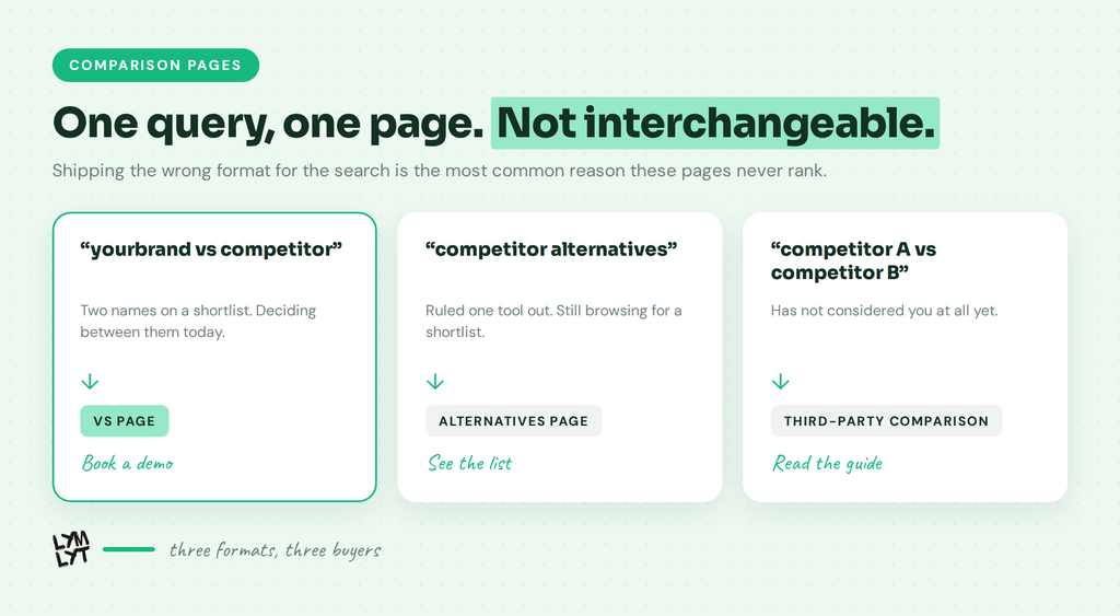
Teams use “comparison page” to mean three separate things. They target different searches, they get read by different buyers, and they convert at different rates.
The vs page. You against one named competitor. Lives at /you-vs-them. Targets “yourbrand vs competitor”. The reader has two options on a shortlist and is trying to close it down to one. This is the shortest path to revenue on your entire site. Our own ChatGPT vs Claude for B2B SaaS content is a blog-side version of the same shape.
The alternatives page. Best alternatives to a competitor. Lives at /competitor-alternatives. Targets “competitor alternatives”. The reader has already decided against that tool, or never had it, and wants a shortlist. Different intent, different page shape, and it converts more slowly because the reader is still browsing. See the best Make alternatives and the best Skale alternatives for how we build them.
The third-party comparison. Two products, neither of them yours. You publish “Notion vs ClickUp” and appear as the third option for readers who dislike both. Hardest to do well, and only worth it when your product is a genuine category-adjacent alternative rather than a direct swap.
Most teams build one and call it coverage. The vs page and the alternatives page are not interchangeable, and shipping the wrong format for the query is the most common reason these pages sit on page two.
Why comparison pages got more valuable, not less
The standard argument for comparison pages is bottom-funnel search volume. That is now the smaller half of the case.
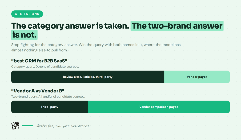
Buyers run their comparisons through AI assistants, and assistants do not rank pages. They pull a handful of sources and write an answer. Comparison content gets pulled in easily, because it is already shaped the way a model reads: named entities, explicit differences, dimensions set side by side.
The catch is who gets pulled. Rampiq found around 85% of citations for broad B2B category queries came from third parties rather than vendor sites. Ahrefs went through 26,283 source URLs behind ChatGPT answers and found comparison listicles in every one of the top 1,000 most-cited pages it checked. Our own run across 18 buying questions landed in the same place.
Read that as an instruction, not a defeat. Your vs page will not out-cite G2 on a category query, and the G2 and Capterra data says as much. It does not need to. It needs the query with both brand names in it, where the model has three or four candidates to choose from and yours is the only one written by someone who knows both products in detail.
That fight is winnable, and nobody is showing up for it. More on how retrieval picks its sources: getting cited in Perplexity, why your site doesn’t show up in ChatGPT, how search behaviour changed, and the channels you ignore.
Which pages to build first
The default approach is to list your five biggest competitors and write five pages. That produces two pages that matter and three that will never be read.
Build the list from evidence instead.
1. Pull the last 50 closed-lost deals. Which vendor did you lose to, and how often. That is your real competitive set, and it usually differs from the one on your positioning slide.
2. Pull the last 50 closed-won deals. Which vendor did you displace. Switchers are the highest-converting audience a comparison page has, because they arrive with a specific complaint you can name.
3. Check what is already ranking for “you vs them”. If a Reddit thread, an affiliate roundup, or your competitor’s own page owns that query today, you are already losing that comparison. You just are not watching it happen.
4. Ask two sales reps for the objection they hear most. Not the feature gap. The objection. The page has to answer that in the first screen.
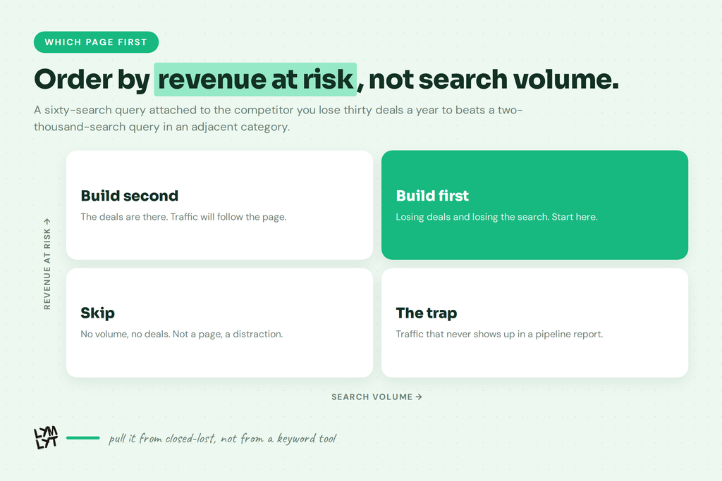
5. Check the search volume last. A 60-search-a-month query attached to a competitor you lose 30 deals a year to is worth more than a 2,000-search query in an adjacent category.
Order the list by deal value at risk, not by search volume. Then build them one at a time and finish each one properly. Fifty thin pages is a Google problem waiting to happen. Five deep ones is an asset. If you want the brief written before the page, our content brief generator turns a keyword into something a writer can actually work from.
The structure that works
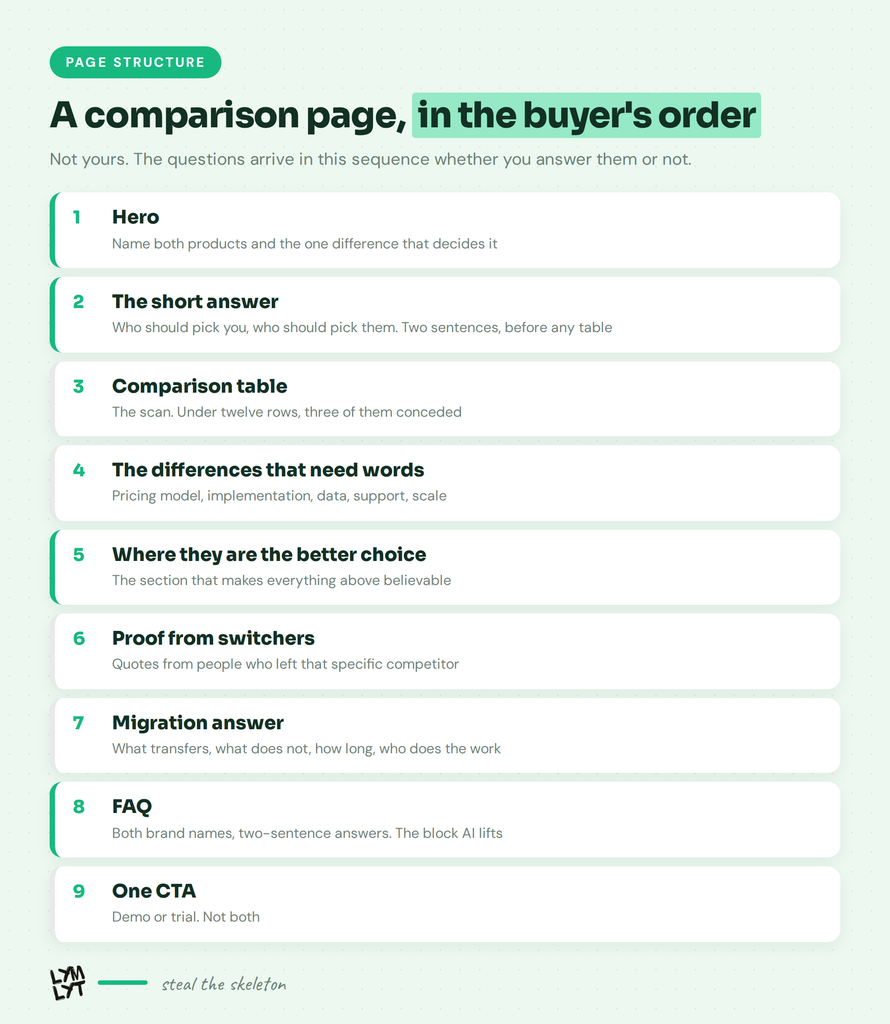
A comparison page runs the buyer’s questions in the buyer’s order, not yours. The landing page rules mostly hold, but the sequence changes.
Hero. Both product names and the one difference that decides the choice. Not “the better alternative to X”, which says nothing. Try “X is built for teams with a dedicated ops person. We are built for teams without one.”
The short answer. Two or three sentences of plain prose, before any table: who should pick you, who should pick them. This is the paragraph an AI lifts and a buyer screenshots into Slack.
The comparison table. Rules in the next section. It goes here, not at the top.
The differences that need words. Three to five sections, one real dimension each: pricing model, implementation, where the data lives, support, what happens at scale. A checkmark cannot carry these. Explain why the trade-off exists.
Where they are the better choice. A real section, not a hedge. More below.
Proof from switchers. Quotes from people who left that specific competitor, naming what they left for. Generic testimonials do nothing here. Our case study guide and interview guide cover getting that on record, anonymously if legal will not clear the logo.
Migration answer. The unspoken objection on every vs page is that moving will hurt. Answer it with specifics: what transfers, what does not, how long it takes, who does the work.
FAQ block. Six to eight questions using both brand names, answered in two or three sentences. The most extractable block on the page, and where you catch “does X integrate with Y”.
One CTA, repeated. Demo or trial, whichever matches how you sell. Not both. Traffic with no demos is usually a CTA problem.
The comparison table is what wrecks these pages
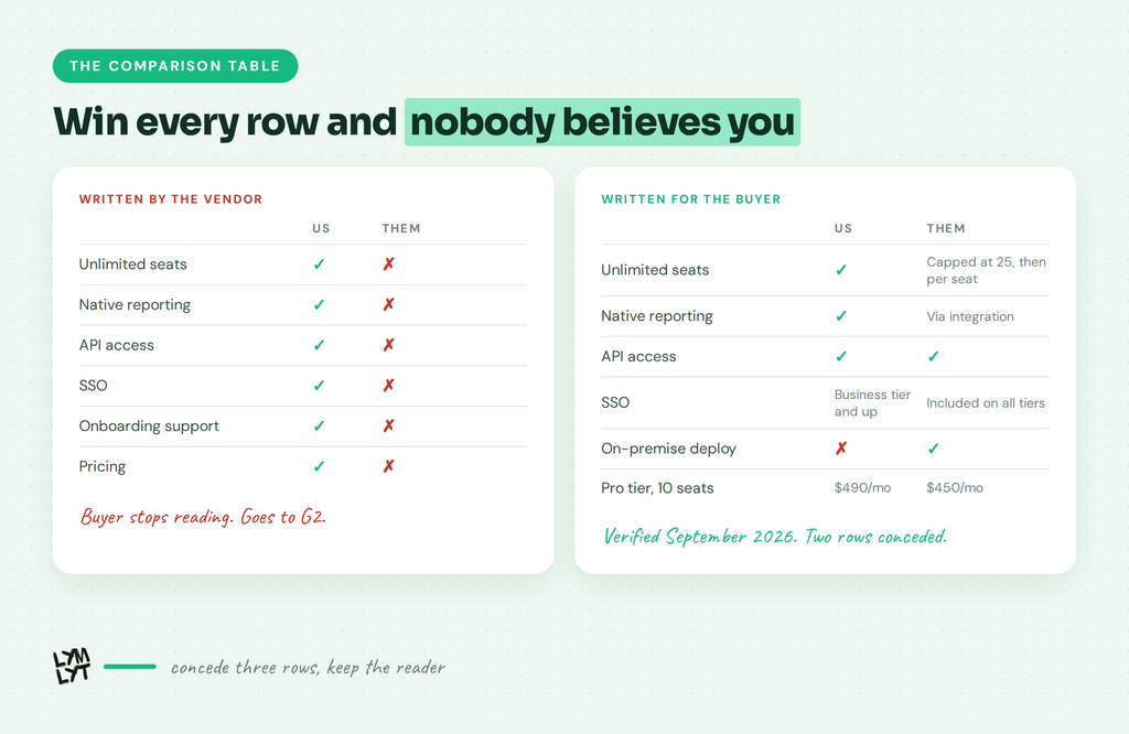
Every column of green ticks on your side and red crosses on theirs tells the reader exactly one thing: this table was written by the vendor. They stop trusting the page, and they go find a source that is not you.
Rules that keep a table credible:
- Concede at least three rows. If a competitor genuinely does something better, the row says so. A table where you lose nothing is a table nobody believes.
- No cross for a feature they have. If they support it through an integration or a workaround, write “via Zapier” or “add-on, from $X”. Marking it as absent is the fastest way to get a legal letter, and it is trivially disprovable by a buyer with a trial account.
- Compare like for like on pricing. Your Pro tier against their Pro tier, same seat count, same billing period, with the date. Price rows go stale fastest and they are the rows buyers check hardest.
- Date the table. “Verified September 2026” at the bottom. It signals maintenance to buyers and gives AI systems a recency marker.
- Keep it under 12 rows. A 40-row table is a way of hiding the three rows that matter.
- Ship it as HTML. Not an image, not a PDF, not a JavaScript-rendered widget. If a crawler cannot read your table, it does not exist to the systems doing the summarising.
The section everyone skips: where they win
Every self-published comparison ends with the publisher winning. Buyers know this, and they discount the whole page accordingly.
The move that beats it is naming the two or three cases where the competitor is the better buy. Real cases, not fake ones. “If you need on-premise deployment, they support it and we do not.” “If your team is over 500 seats, their admin tooling is more mature.”
This does three things at once. It sends away the buyers who would have churned in four months. It makes every other claim on the page more believable, because you have now proved you are willing to say something against your own interest. And it gives AI systems the balanced framing they prefer, since a page that reads as pure marketing copy is a weaker candidate for citation than a page that reads as an assessment.
Philippe Lehoux of Missive has credited honest us-versus-them pages, including admitting where a competitor is the better fit, as a driver behind reaching $2.1M ARR. The counterintuitive part is that giving away the losses is what makes the wins land. We write our own alternatives posts the same way, opening by saying the competitor is good.
Sales teams push back on this section every time. The answer is that the buyer will discover the gap anyway, on a trial, on a call, or in a Reddit thread. The only variable is whether they find it from you first.
What the law actually requires
Naming a competitor is legal and normal. Getting the substantiation wrong is where companies lose.
Trademark use is fine. Using a competitor’s name to identify their product is nominative use, and the statute is direct about it: section 1125(c)(3)(A)(i) protects fair use of even a famous mark in advertising that lets buyers compare products. What is not fine is implying endorsement, or dressing your page to look like theirs.
Your competitor can sue you directly. Section 43(a) of the Lanham Act gives them a private right of action over a false or misleading claim about their product. No regulator has to get involved.
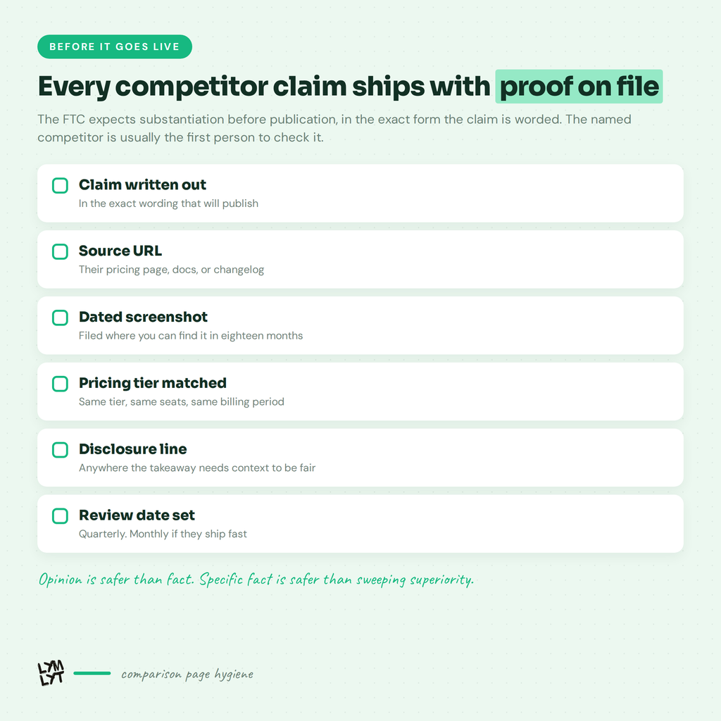
The FTC encourages comparison and polices the proof. Its Statement of Policy, codified at 16 CFR 14.15, says naming competitors helps buyers as long as the basis of comparison is clear. Substantiation has to exist before publication, in the exact form the claim is worded. A claim that was true when you drafted it and false when you shipped it is still a false claim.
Literally true can still be misleading. A price comparison that hides a significant feature gap is the textbook example.
NAD moves faster than court. Any company can challenge a competitor’s claims at the National Advertising Division, and its Fast-Track SWIFT route decides single-issue digital cases in 20 business days. That is the timeline to plan against.
Selling into the EU? Article 4 of Directive 2006/114/EC sets eight cumulative conditions a comparison has to meet. Cumulative means all eight, not your favourite six.
Every claim gets a source, a screenshot and a date, filed somewhere you can find it in eighteen months. Opinion is safer than fact, and specific fact is safer than sweeping superiority. “Faster” needs a test. “Simpler” is puffery and generally survives.
Writing for the second reader
Your comparison page now has two audiences. A buyer who skims it, and a retrieval system that lifts passages out of it.
The formatting that serves both:
- Answer first under every heading. Two sentences that stand alone, then the detail. Models lift self-contained passages, and skimmers read exactly those two sentences.
- Use both brand names in headings. “How [Competitor] pricing compares to ours” beats “Pricing”. Entity names in headings are how a model knows the passage is about the query.
- Write the FAQ as real question and answer pairs. Question phrased the way a buyer would type it. Answer in two or three sentences, self-contained.
- Repeat the entity names in body text. Pronouns are cheap for a human reader and expensive for a machine one.
- Keep the numbers in text, not only in images. A chart with the data only in the image is invisible to everything that summarises.
For the full picture on structuring content for retrieval, see llms.txt: what it is and whether you need one, the AI visibility glossary for the terms, and the free AI visibility checklist to score where you currently stand.
Maintenance is not optional
A comparison page is the only page on your site that goes wrong without you touching it, because your competitor keeps shipping.
Every stale row is three problems: a buyer who catches the error and discounts the page, an AI system quoting your outdated claim back to prospects, and a substantiation record that no longer matches the claim you are publishing.
Set a quarterly audit. Re-check pricing, re-check the feature rows you concede, re-check the rows you win, update the verified date. Monthly if the category moves fast or the competitor is in a shipping sprint. If your team cannot commit to the audit, build three pages instead of ten.
Measuring it properly
Comparison page conversion rate on its own is a vanity metric, because the traffic is small and already qualified. Traffic on its own is worse, as HubSpot’s blog collapse made obvious.
Track instead:
- Assisted pipeline. Deals where a comparison page appeared anywhere in the journey. This is the number that justifies the budget.
- Ranking for “brand vs brand”. Position one or nothing. Position four on a two-brand query is not a result.
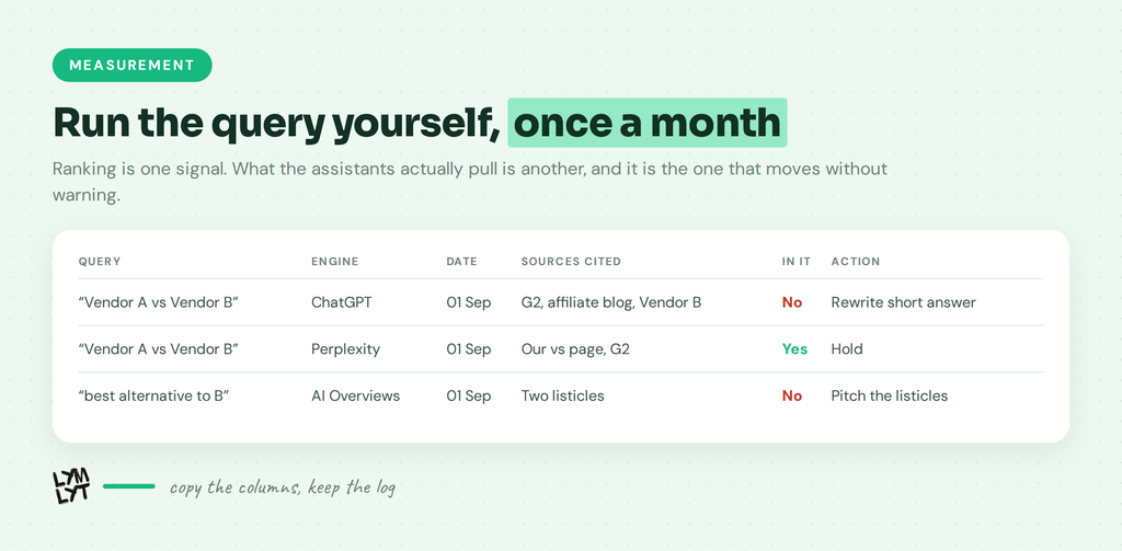
- Whether the page gets cited. Run the “X vs Y” query in ChatGPT, Perplexity, Gemini and AI Overviews once a month. Log what gets pulled. If it is a three-year-old affiliate post, you know what to fix.
- Sales usage. If reps are not sending the page in follow-ups, either it is not good enough or nobody told them it exists. Both are fixable this week.
- Win rate against that named competitor, before and after. Slow signal, but the only one the CFO cares about.
When not to build one
Skip the comparison page if you have no real competitor, if you cannot substantiate a single differentiated claim, if your product genuinely is worse on every dimension a buyer would name, or if nobody on the team will own the quarterly update.
That last one disqualifies more teams than the other three combined.
FAQ
Are competitor comparison pages legal? Yes, in the US and in the EU, as long as every factual claim is truthful, substantiated before you publish, and not misleading by omission. Naming a competitor and using their trademark to identify their product is permitted nominative use.
Should we build a vs page or an alternatives page first? Whichever matches the query you are losing. If you only build one, make it the vs page for the competitor taking the most deals off you.
How long should a comparison page be? Usually 1,200 to 2,000 words plus a table. Long enough to answer the buyer’s real questions and no longer, since thin pages neither rank nor convert.
Will our competitor retaliate with their own page? Probably, and it barely matters. Both pages can rank, buyers read both, and the one who concedes more honestly tends to win that exchange.
Should we run ads to comparison pages? Often yes, since intent is high and the audience is small. Check the ad platform’s trademark policy first, because bidding on a brand name and using it in ad copy follow different rules.
How many comparison pages should we have? As many as you can keep accurate. Five maintained pages beat thirty stale ones, and the stale ones carry legal risk the good ones do not.
Comparison pages are the last thing a buyer reads before they rank you, and the first thing an assistant reaches for when someone asks how you stack up. Writing one is a research job before it is a copywriting job.
That is the job we do. See how we write competitor comparison pages, look at our work, check pricing, or book a 30-minute call.

Jay is the co-founder of LymLyt and an AI partnership consultant helping B2B SaaS companies grow through content strategy, SEO, and AI integration. He writes about content marketing, what makes B2B content convert, and how SaaS teams can build content systems that drive real pipeline.