
The Heart of the Website: Landing Page vs. Homepage
Most B2B SaaS websites have a homepage. Fewer have dedicated landing pages. And almost none have the right content on either.
The landing page vs. homepage confusion is one of the most common reasons marketing spend underperforms. You run a campaign, send traffic to the homepage, and wonder why conversions are low. Or you build a landing page that tries to do everything a homepage does and ends up doing neither well.
They are not interchangeable. They serve completely different purposes, attract different types of visitors, and should be designed and written with completely different goals in mind.
Here is the full breakdown.
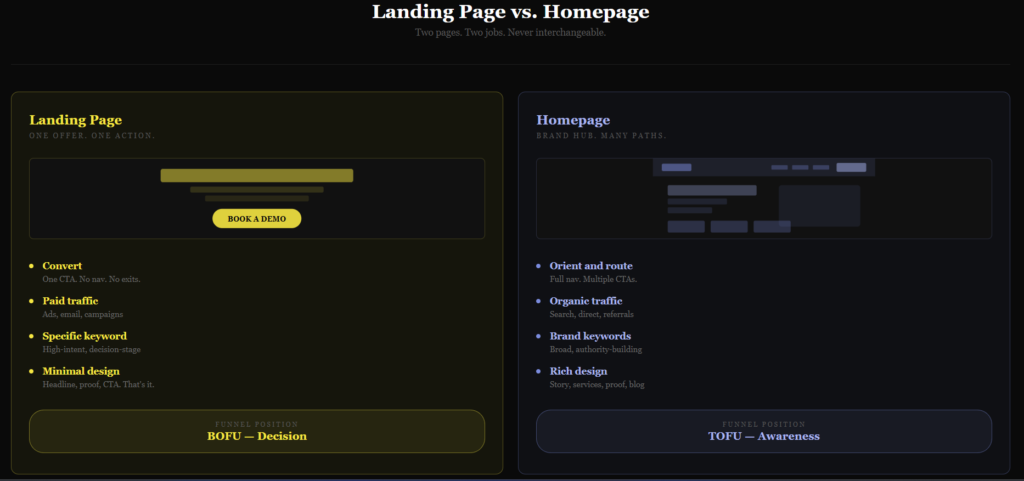
1. Purpose: Conversion vs. Navigation
Landing page: A landing page has one job. Convert the visitor. Whether that means filling out a form, booking a demo, downloading a resource, or starting a trial, every element on the page exists to move the visitor toward that single action. There is no exploration, no browsing, no “find out more about us.” Just a clear offer and a clear path to accepting it.
Homepage: Your homepage is the front door of your business. It serves as a central hub, giving visitors a broad overview of who you are, what you do, and where to go next. Its job is not to convert immediately. It is to orient, build credibility, and route visitors to the part of the site most relevant to them. A homepage that tries to convert like a landing page usually does neither well.
The distinction matters most when you are running paid campaigns. Sending ad traffic to a homepage is one of the most common SaaS content mistakes that kills conversion rates before a visitor even reads the offer.
2. Traffic Sources: Targeted vs. Organic
Landing page: Visitors arrive via paid ads, email campaigns, social media promotions, or specific outbound sequences. They arrive with a specific context because they clicked something that promised them something specific. The landing page exists to deliver on that promise immediately and move them to act.
Homepage: Receives a mix of traffic from organic search, direct visits, referrals, and brand searches. These visitors are at different stages of awareness and have different intentions. Some know exactly who you are. Some stumbled in from a blog post. Some are comparing you to competitors. The homepage has to speak to all of them without alienating any of them.
This traffic difference alone explains why homepage content writing requires a completely different approach from landing page copywriting. The homepage speaks to a crowd. The landing page speaks to a person with a specific problem who clicked a specific promise.
3. Content: Focused vs. Comprehensive
Landing page:
- Concise and persuasive, focused entirely on one offer
- Highlights the specific benefit the visitor was promised when they clicked
- Addresses the most likely objections to taking the action
- Includes social proof relevant to the specific offer (testimonials, case studies, client logos)
- Every word earns its place by moving the visitor closer to the CTA
Homepage:
- Covers your brand story, services, social proof, and navigation
- Provides a well-rounded introduction to the full business
- Links to deeper content: blog posts, service pages, case studies
- Speaks to multiple visitor types without assuming they all want the same thing
- Creates entry points for different buyer journeys rather than funnelling everyone to one action
One useful way to think about it: a homepage is a table of contents. A landing page is a single chapter written to make one argument and close one deal.
4. Design: Single Focus vs. Multiple Paths
Landing page:
- Conversion-centric layout with a clear visual hierarchy
- The headline, CTA, and supporting proof are the dominant elements
- Minimal navigation (often no nav bar at all) to reduce exit paths
- Trust signals placed strategically near the CTA (logos, testimonials, security indicators)
- One CTA, repeated. Not three different actions competing for attention.
The elements of a high-converting landing page follow a clear pattern: headline that matches the ad, benefit-led subheading, proof, and a CTA that removes friction. Anything that does not serve that sequence is a distraction.
Homepage:
- Balanced layout that accommodates multiple user intents
- Multiple CTAs routing visitors to different destinations (pricing, blog, services, contact)
- Full navigation visible and accessible
- Brand identity expressed through visual design, tone, and content choices
- Designed to be browsed, not funnelled
5. SEO Strategy: Specific vs. Broad
Landing page: Usually optimised for a high-intent, specific keyword tied to a product, service, or campaign. Someone searching “B2B SaaS content agency pricing” is much closer to buying than someone searching “what is content marketing.” Landing pages target the former. They are built for short-term conversion from specific queries. This is where competitor comparison pages live: highly specific, high-intent, built to convert the bottom of the funnel.
Homepage: Targets broader, brand-related keywords and establishes the overall authority of the domain. A strong homepage supports the entire site’s SEO by distributing authority through internal links to service pages, blog posts, and case studies. It is the foundation that makes every other page easier to rank.
Both pages need SEO content writing that balances search intent with genuine reader value. The difference is in how narrow or broad that intent is.
6. The Funnel Position: Entry vs. Decision
This is the distinction that ties everything together.
Landing pages sit at the decision point. The visitor has already been warmed up by an ad, an email, or a campaign. They know roughly what they want. The landing page just has to close the gap between interest and action. This is why the SaaS content funnel places landing pages firmly at BOFU. They are not for discovery, they are for conversion.
Homepages sit at the entry point. Most homepage visitors are at TOFU or MOFU. They are aware of a problem and are exploring solutions. They might not even know your product yet. The homepage has to orient them quickly, establish credibility, and give them a clear path to go deeper.
Confusing these positions is what causes most landing page vs. homepage mistakes. A homepage that pushes hard for a demo booking before building any trust will underperform. A landing page that buries the CTA under a full company overview will convert nobody.
When to Use Each
Use a landing page when:
- Running paid ads on Google, LinkedIn, or Meta
- Promoting a specific offer, trial, or lead magnet
- Sending email campaigns to a segmented list
- Running an outbound sequence with a specific proposition
- Testing messaging variations for a specific audience segment
Use the homepage for:
- Brand awareness and organic search traffic
- Direct visitors who already know your name
- Routing different buyer types to the right part of the site
- Establishing overall credibility and authority
The Bottom Line
A homepage builds trust and creates orientation. A landing page removes friction and drives action. Both need to be written and designed with a specific visitor, a specific intent, and a specific outcome in mind.
If you are running campaigns without dedicated landing pages, you are almost certainly leaving conversions on the table. And if your homepage is trying to do a landing page’s job, it is probably doing neither particularly well.
If you need copy that converts on either, let’s talk.
Jay is the co-founder of LymLyt and an AI partnership consultant helping B2B SaaS companies grow through content strategy, SEO, and AI integration. He writes about content marketing, what makes B2B content convert, and how SaaS teams can build content systems that drive real pipeline.