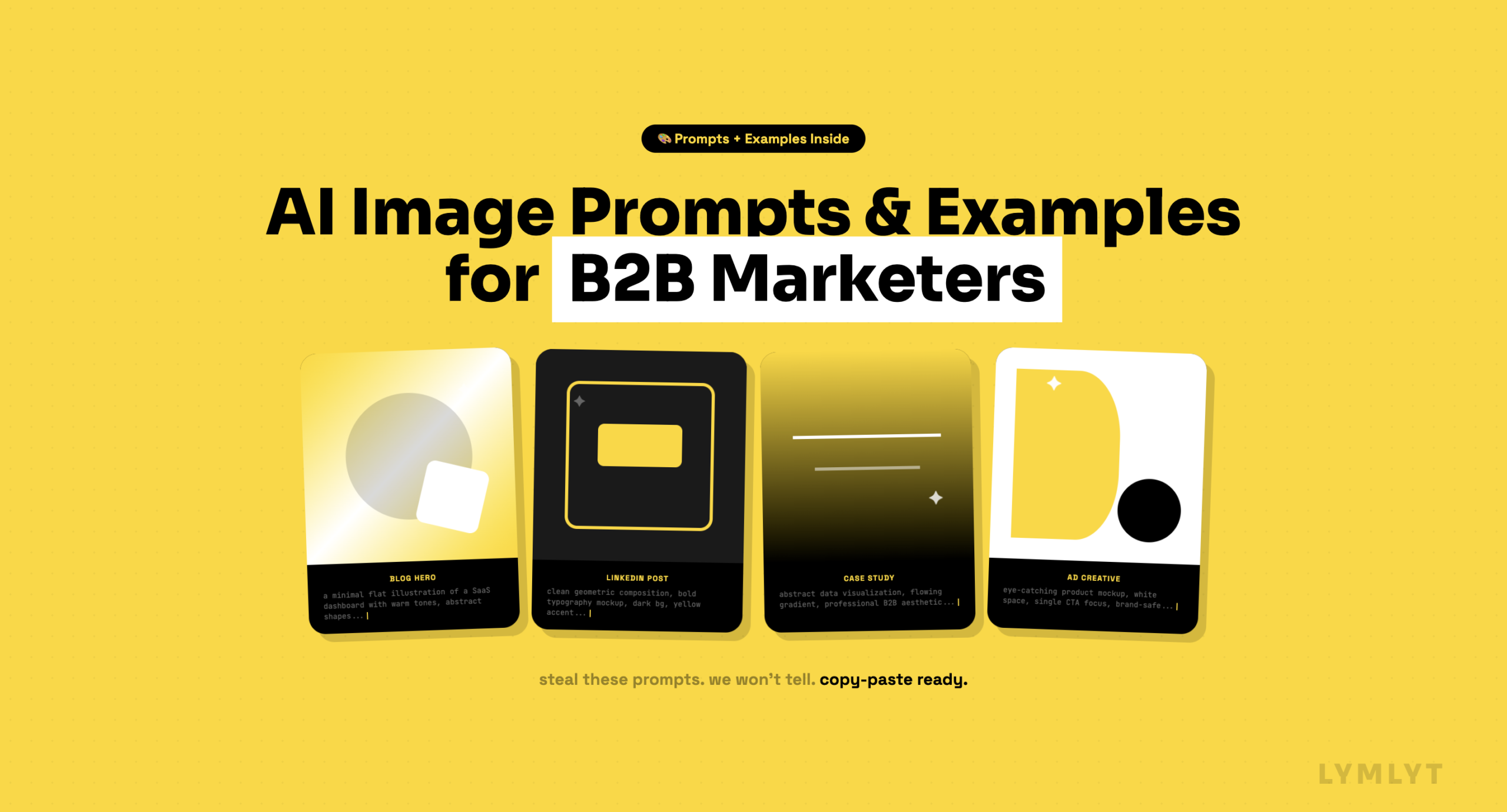
AI image prompts and examples for B2B marketers
Most AI-generated marketing visuals look the same. Not because the tools are bad, but because the AI image prompts are.
When you type “a LinkedIn graphic about SaaS onboarding” into an image generator, you get exactly what that sounds like: something beige, forgettable, and vaguely corporate. The tool did its job. The brief failed.
This is the visual version of content blindness. Audiences scroll past generic visuals the same way they skip generic copy, on autopilot, without registering what they saw. Check why your ICP doesn’t read your blog!
The fix is simpler than most people think. It’s vocabulary. Specific style words that tell the AI not just what to show, but how it should look, what it should feel like, and what visual language it should speak.
This guide is built for B2B content marketers, not hobbyists or digital artists. Every category maps to an asset type you’re actually making. Every example uses a prompt you can lift and adapt today.
A quick note on prompting
Style words work best when added after your subject, separated by a comma. You can stack them. “A bar chart showing churn rate, risograph style, warm tones, high contrast” will outperform “a bar chart showing churn rate” every single time.
The examples below were all generated in ChatGPT. Results will vary slightly each time you run a prompt, so treat these as starting points, not exact outputs.
1. Thought leadership visuals
LinkedIn posts, blog headers, personal brand graphics
These are the visuals that live next to your opinions. They need to feel considered, not stock. The goal is a visual that signals: a real person made this. If you’re building a thought leadership presence, what your graphics look like matters as much as what they say.
Flat design Clean lines, no shadows, simplified shapes. Works well for abstract concepts like frameworks, processes, or ideas that don’t have a physical form.
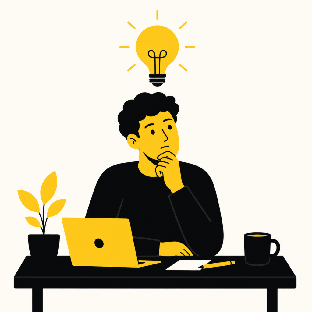
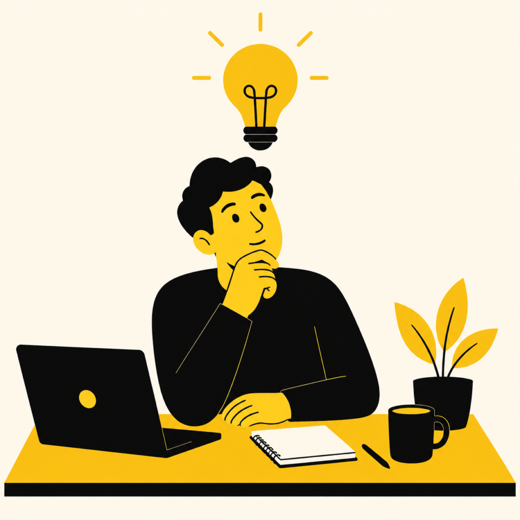
ChatGPT prompt: “A person thinking at a desk with a lightbulb above their head, flat design, black and yellow color palette, minimal background, bold shapes”
Editorial illustration Think magazine spreads. Slightly loose, slightly imperfect, unmistakably human. Great for thought leadership because it reads as crafted rather than generated.
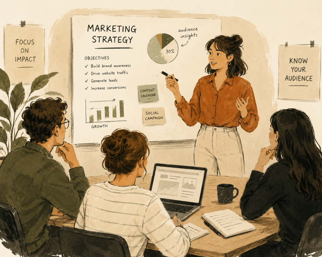
ChatGPT prompt: “A marketer presenting to a small team, editorial illustration style, muted warm tones, ink texture, loose linework”
Bold typographic layout When the idea is strong enough to carry the visual. Stark, high contrast, text as the hero. Works well for stat-led posts or punchy one-liners.
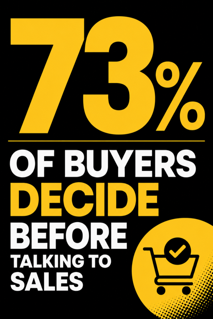
ChatGPT prompt: “The text ‘73% of buyers decide before talking to sales’, bold typographic poster design, black background, yellow accent, Poppins-style sans serif font, high contrast”
Other styles to try:
- woodblock print
- screen print
- collage
2. Data and stat graphics
Charts, infographics, number callouts
Data visuals have one job: make the number impossible to scroll past. Most fail because they look like a default Excel export. This matters especially for SEO content and blog posts where a well-styled stat graphic can be the difference between someone sharing your post or closing the tab.
Risograph Slightly grainy, overlapping color layers, tactile texture. Makes data feel less clinical and more designed.
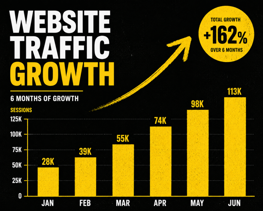
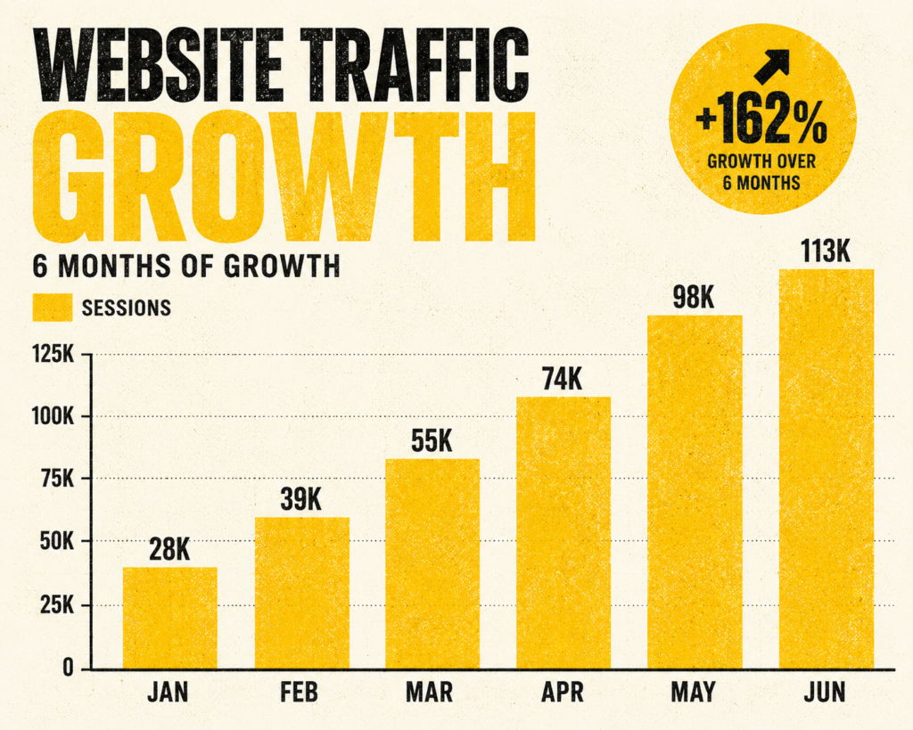
ChatGPT prompt: “A bar chart showing website traffic growth over 6 months, risograph style, yellow and black color palette, grainy texture, bold labels”
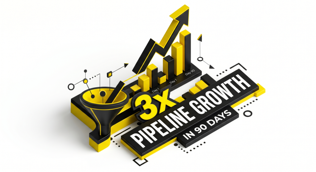
Isometric illustration Three-dimensional flat shapes. Good for showing volume, scale, or comparison without needing a traditional chart format.
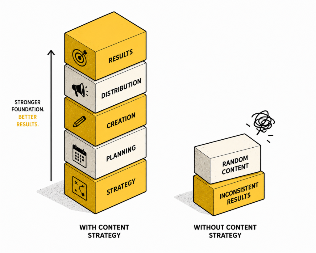
ChatGPT prompt: “An isometric illustration comparing two stacks of blocks, one tall and one short, labeled ‘with content strategy’ and ‘without’, black and yellow, clean background”
High contrast minimal One dominant color, white space, sharp typography. The data is the design.
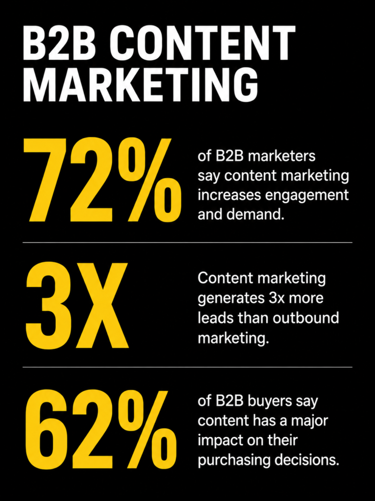
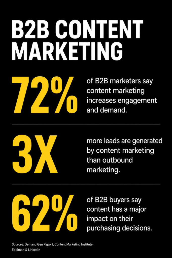
ChatGPT prompt: “A minimal infographic showing 3 statistics about B2B content marketing, high contrast, black background, yellow numbers, white text, lots of white space, no decorative elements”
Other styles to try:
- neon on dark
- hand-drawn sketch
- papercut
3. Product and feature visuals
SaaS UI mockups, explainer graphics, feature announcements
These need to feel polished without feeling like a vendor brochure. The challenge is showing a product in a way that communicates value rather than just showing the interface. If you’re writing landing page copy alongside these visuals, the style of the image and the tone of the copy need to match.
Glassmorphism Frosted glass effect, soft transparency layers. Makes UI mockups feel modern and premium.
ChatGPT prompt: “A SaaS dashboard UI mockup, glassmorphism style, dark background, frosted glass panels, soft blue and white glow, clean typography, minimal data”
Blueprint style White lines on dark blue, technical drawing aesthetic. Works surprisingly well for feature explainers and architecture diagrams.
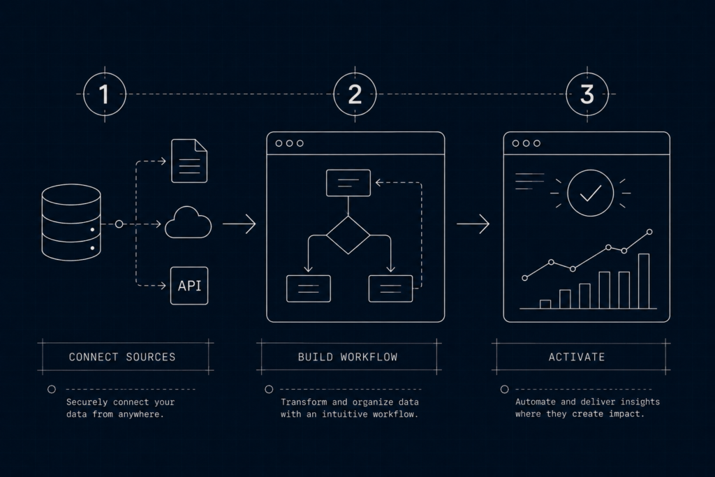
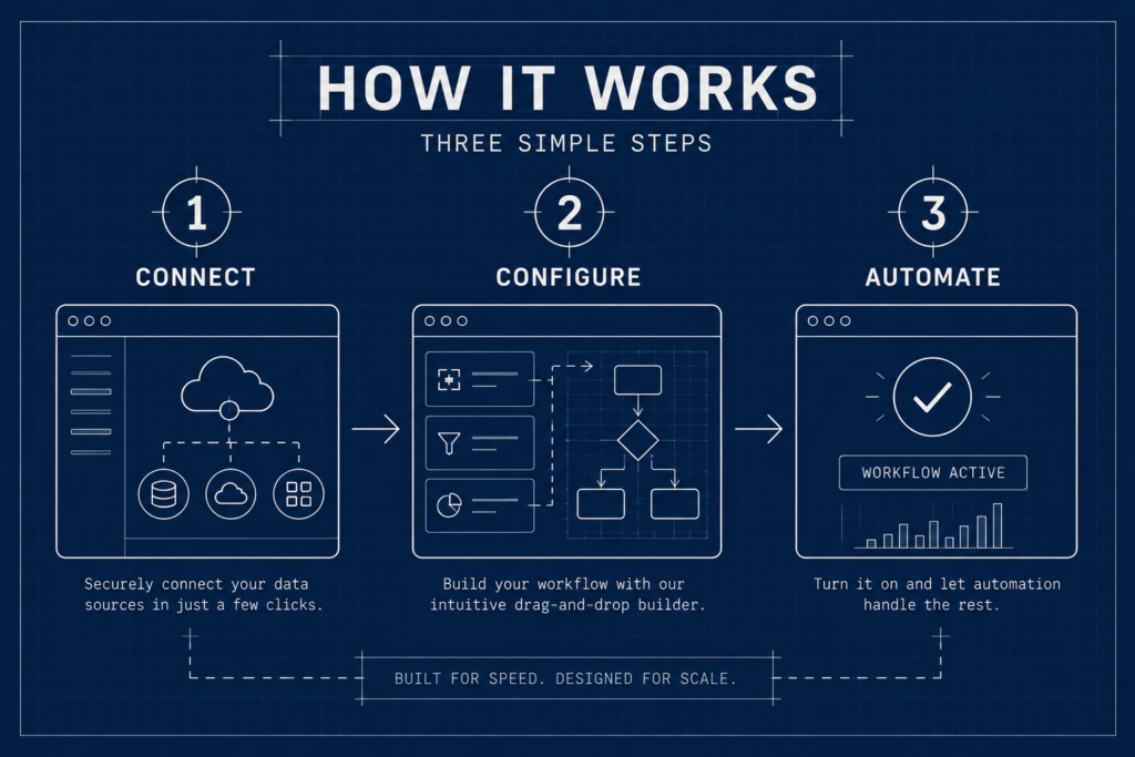
ChatGPT prompt: “A product feature diagram showing a workflow with three steps, blueprint style, white lines on dark navy background, technical drawing aesthetic, labeled steps”
Floating device mockup The product UI displayed inside a clean device frame, floating on a gradient or solid background. Familiar but effective when styled well.
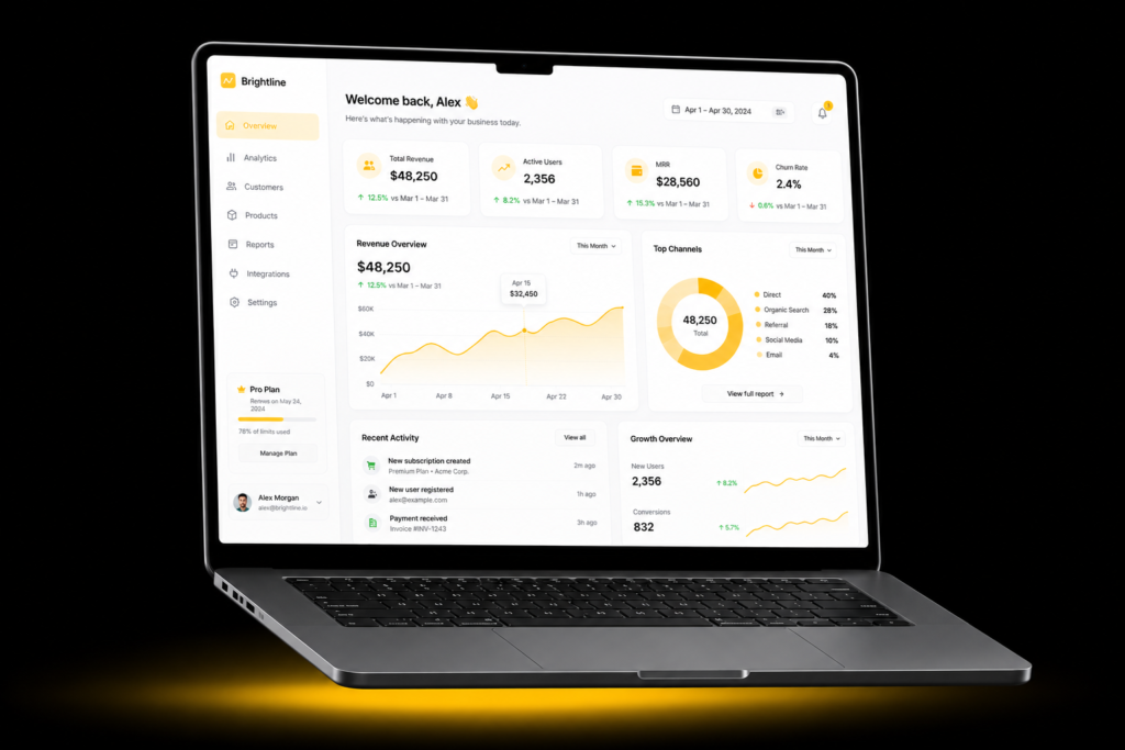
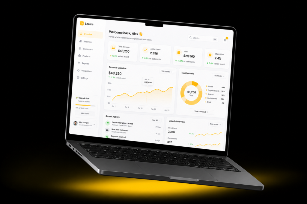
ChatGPT prompt: “A laptop mockup floating on a black background with a yellow gradient glow underneath, showing a clean SaaS analytics dashboard on screen, minimal surrounding elements, studio lighting”
Other styles to try:
- neon wireframe
- cutaway diagram
- pixel art
4. Social proof assets
Testimonials, case study pull quotes, results callouts
Social proof visuals are often the most neglected. They’re treated as text boxes with a headshot. Styled well, they become the most shareable thing on your page. If you’re building out case studies, the visual treatment of your proof points deserves the same attention as the writing.
Quote card with texture A strong testimonial deserves more than a white box. Adding paper texture or grain makes it feel real rather than designed-by-template.
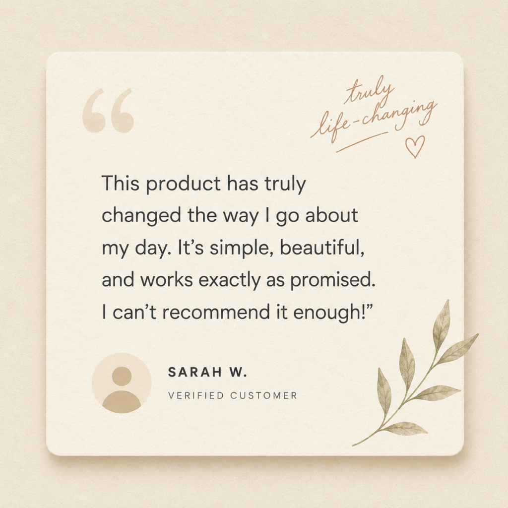
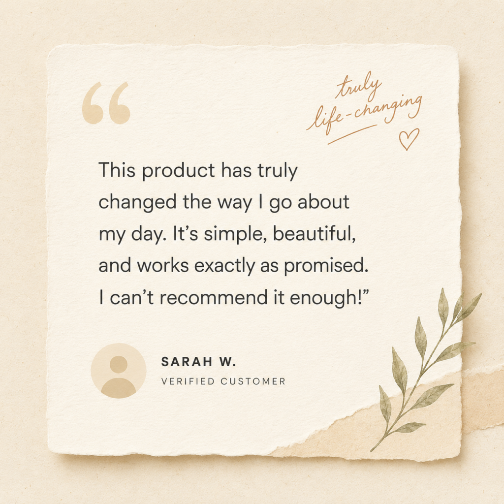
ChatGPT prompt: “A testimonial quote card design, paper texture background, handwritten-style accent, clean sans serif quote text, small circular avatar placeholder, warm cream tones, minimal layout”
High key portrait style When you have a real photo of the customer, high key lighting treatment makes the headshot feel editorial rather than LinkedIn-profile.


ChatGPT prompt: “A professional headshot of a person in a black turtleneck, high key photograph, white background, soft studio lighting, clean and editorial feel”
Bold results callout Numbers deserve their own visual. A results graphic that leads with the outcome, not the story.
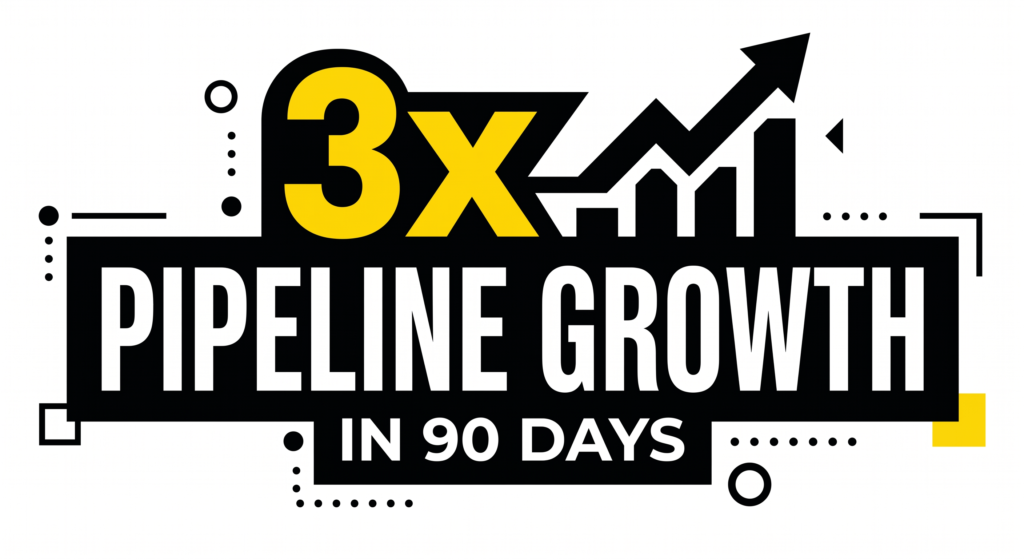
ChatGPT prompt: “A results callout graphic showing ‘3x pipeline growth in 90 days’, bold typographic design, black background, yellow highlight on the number, minimal supporting text, high contrast”
Other styles to try:
- polaroid frame
- sticker sheet
- newspaper clipping
5. Sales and outreach visuals
Pitch deck slides, one-pagers, email header graphics
These visuals are doing a job in a high-stakes context. They need to feel credible, not creative for creativity’s sake. If you’re working on lead-gen resources or building out sales collateral, the visual style you choose is sending a signal before anyone reads a word.
Clean geometric Structured shapes, grid-based layout, nothing superfluous. Communicates that you think in systems.
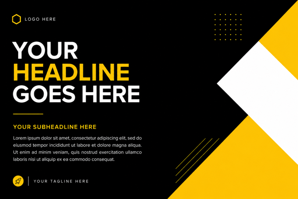
ChatGPT prompt: “A pitch deck slide layout, clean geometric design, black background, yellow and white geometric shapes as accents, space for headline text and body copy, minimal and structured”
Dark mode professional Dark backgrounds with white type and a single accent color. Feels more premium than the default white slide.
ChatGPT prompt: “A one-pager layout design, dark mode, charcoal background, white headline, yellow accent line, clean sans serif typography, two-column layout, professional and minimal”
Bokeh background A softly blurred background with a sharp foreground subject. Good for email headers and section dividers where you want visual depth without distraction.

ChatGPT prompt: “An email header graphic for a B2B SaaS company, bokeh background, dark tones, sharp foreground text area, subtle yellow light source, professional and clean”
Other styles to try:
- gradient mesh
- editorial grid
- duotone
The full style word list
Use this as a cheat sheet when writing your prompts. If you use our free brief generator for content briefs, the same principle applies here: the more specific your input, the better your output.
For thought leadership visuals Flat design, editorial illustration, bold typographic layout, woodblock print, screen print, collage, risograph, ink texture, loose linework
For data and stat graphics Risograph, isometric illustration, high contrast minimal, neon on dark, hand-drawn sketch, papercut, blueprint, infographic flat
For product and feature visuals Glassmorphism, blueprint style, floating device mockup, neon wireframe, cutaway diagram, pixel art, dark UI, frosted glass
For social proof assets Paper texture, high key portrait, bold results callout, polaroid frame, sticker sheet, newspaper clipping, grain overlay, warm tones
For sales and outreach visuals Clean geometric, dark mode professional, bokeh background, gradient mesh, editorial grid, duotone, structured grid, charcoal and white
Finishing up
Style words are not a shortcut. They’re a brief. The difference between a generic AI visual and one that actually stops someone mid-scroll is almost always in the language used to ask for it. To stay current on which image generation tools are worth using, the best AI newsletters in 2026 cover new tool releases faster than any blog
Start with one category, one asset type you make regularly, and work through a handful of style combinations. You’ll build a set of go-to prompts that produce consistent, recognizable visuals faster than briefing a designer from scratch every time.
The vocabulary is the skill. Now you have it.
Need help with the content that goes alongside these visuals? See how LymLyt approaches blog writing for B2B SaaS.
Rashmita is content marketer with 8 years of experience building and growing SaaS brands. Now she tests various AI tools for marketers and shares her feedback on this blog, LinkedIn, Instagram, and YouTube.